Dashboards
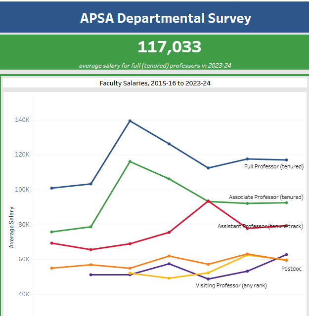
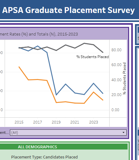
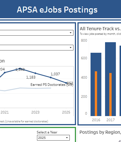
APSA’s interactive dashboards allow users to visually explore the APSA’s demographic composition of the profession, of our membership, and of APSA Organized Sections. The Departmental, Graduate Placement, and eJobs dashboards allow users to examine a variety of data on the profession and the political science job market, including degrees granted, graduate student job placements, and much more. Our data dashboards are updated regularly throughout the year and allow users to see changes over time.
If you are interested in the data underlying these dashboards and cannot find what you are looking for in the data downloadable from the dashboards, please look at what is available on our datasets page, or submit a data request form here.
To view the Membership or Organized Sections dashboards, select the relevant dashboard or image below. Have questions or difficulty using the dashboards? Email us at surveys@apsanet.org.
Access to the dashboards below is restricted to APSA members.
You will be prompted to log in with your APSA credentials to continue.

The Membership Dashboard reveals insights into where members are located, highlights demographic information, and shows the variety of fields that members study.

The MENA Workshops Alumni Dashboard provides a look at alumni of the APSA MENA Workshops, including an interactive map of alumni, as well as alumni fields of study and organized section membership.

The P-WAM dashboard features data from the largest PhD granting institutions in political science on the gender and race/ethnicity of their faculty.

The Organized Sections Dashboard outlines the demographic breakdown – including membership type, race/ethnicity, gender, age, and primary field of study – of APSA’s organized sections.